 |
| http://www.skalaplus.com/sitebuilder/images/TheBean_lg-482x360.jpg |
Bold
Depth
singular
contrast
balance
asymmetry
simplicity
economy
stasis
brightness
roundness
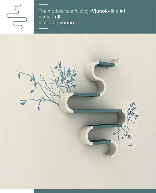 |
| http://www.smashingapps.com/wp-content/uploads/2009/08/modular-shelving-unit.jpg |
Contrast
asymmetry
irregularity
simplicity
unity
economy
understatement
predictability
subtle
neutral
opaque
variation
depth
singular
sequential
episodicity
roundness
These two designs are actually kind of similar, even though they are both for a different purpose. They both have contrasting colours and are for holding something - chair holds people, shelf holds objects.
They are both visually pleasing and opaque and are both very simple and elegant. they are understated pieces of design. although the shelf has a feeling of epidosicity and continuity and the chair is very singular in itself on its own.
The shelf looks like it could have more added on to it easily but the chair is completely finished as a whole and couldn't have more added on if needed.

